Sunday 30 December 2012

Just in ! Dystopian Legions. Kingdom of Britannia. 'Ready. Aim. Fire!'

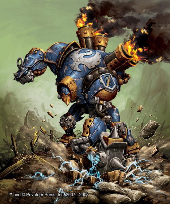
As one of the 'Christmas arrivals' I have now acquired a Kingdom Of Britannia Starter Set from Spartan Games. It's from their new game based in the same the world as Dystopian Wars. At the moment I guess we're looking at skirmish level gaming here - but I'm assuming that in  time more products will appear to enable the game to be scaled up. These are already coming out. So, there are four Armies - Kingdom Of Britannia, Empire Of The Blazing Sun, Prussian Empire and the Federated States Of America. I believe some mercenaries will eventually find their way out too.

Up and at 'em!

I got a lot of my initial information from the chap at Tales Of A Tabletop Skirmisher - ( http://pressganger.blogspot.co.uk/ ) and he does a pretty good job of reviewing everything that's going on  with this game currently.

I think what caught my eye mainly was the Victorian/steampunk theme of the British set, but it's also clear from the poses and some of the language on the game cards that there is obviously a 'tongue-in-cheek' quality about the whole affair. There are game effects called 'Stiff Upper Lip', 'Tally Ho!' and 'How's that!' for example. And the captain in the Starter Set is called Gilbert Smethington and he clearly has more than a passing resemblance to Flashheart from the Black Adder TV series.

Woof!

Anyhoo I did a vid -


Looking forward to painting and absorbing the quickplay rules which were included in the set. Good value at £37 or so, there's a lot in the box. A free PDF of the quickplay rules is available at Spartan Games as well as some other helpful downloads. 'Carry On, Sergeant!'

Wednesday 31 October 2012

The new look 'White Dwarf' vs 'No Quarter' ... a penny for my thoughts?


 White Dwarf #395 November 2012

What I'd thought I would do with this post is to consider a face-off between these two titles. It's Games Workshop vs. Privateer Press.

Games Workshop have recently revamped the design and content of their decades running monthly magazine - we are currently on November's issue (£5.50), the second of the new format. No Quarter is on Issue No. 44 and is bi-monthly ( about £4.50 depending) - representing seven years or so. I love magazines, I confess. And books. I'm not one for Kindles or tablets. I want to turn the pages by hand. A physical sensation. A4 size.If I want a close up, I move the page closer.

Ah, I remember, back in the day, reading RPG backgrounds and 'Thrud The Barbarian' cartoons,  all in amongst the various wargaming articles and reviews in the old White Dwarf. I then left for a long time and a few years ago, came back to a completely different publication that was very much focused solely on the models and the Warhammer gaming universes. There wasn't much else. Not that that was a bad thing, I needed lots of information to get going again with all of the gaming knowledge that had bypassed me. And I loved the rich variety of source material that provided ample inspiration for my painting, especially - and here I bow - the fantastic 'Eavy Metal articles that helped me move my painting on to a new level (or at least to a more acceptable one!).

Why all this preamble? Well, I guess because No Quarter has a bit of that feel about it. There is ample background 'fluff'. Indeed it seems clear that No Quarter is continually helping to build the Warma/Hordes universes as it goes along. The pages often feel like extracts from a 'codex' of sorts. The layout supports this design style too. Pages seem like they have been torn from journals, or from ancient reports and there are a variety of colours and font styles used, which go hand-in-hand with the type of faction being discussed. There is also a great deal of fantastic artwork and and page-edge design that really gives the magazine a sense of coherency across the various different sections of the magazine itself. There are RPG backgrounds, short stories, reviews and articles about other products from Privateer Press. The readers are also represented with examples of their painting and often the opening editorial-style articles show that the staff actually do go out into the wide world.


In Issue 44 of No Quarter, you've got detailed conversion articles, the obligatory catalogue pages (only a few though), tournament and painting sections, background, army building, a section on playing scenarios in another game (Level 7), RPG info, battle reports, and readers' models.  I do feel that the photographing isn't up to scratch - this sometimes helps blur the fact that some of the models used in the articles aren't quite up to the painting level of WD. There's a lot here, though I would say that compared to White Dwarf, there's a little more of a sense of randomness about the content. I never know quite what I'm going to get! Until recently, with White Dwarf, I knew exactly. It had come to feel too much like a catalogue for the products and if you weren't into this month's catalogue items, you were left a bit miffed at not having a great deal to delve into. I feel that if WD could learn anything, it would be about page design and the use of stories and background to help the universe 'live' in the pages.


Then we come to the new White Dwarf. To begin : I like it. I like it a lot. The strident design, the attempts to show us the real people at GW. I think ' This month in...' is a great idea. The fantastic photographs - and the infinite painting guidance that this represents. I also am really pleased that they have broadened their outlook -Forge World, novels, audio books - golly Fantasy Flight Games even got a look in with their 40K related board game! It feels all the better for this. The articles are also more discursive, exploratory and there is less reliance on a 'wodge' of bat reps. The catalogue feel is still there, however, but it now feels more like a model showcase, with excellent close-ups and atmospheric backgrounds. I'm still not sure what Blanchitsu is for (though I love his painting style and artwork - so keep it coming) and I'm also not really convinced by either of the rather similar,  Jeremy Vetock and Jervis Johnson articles. They can all too easily appear to be bland and entirely irrelevant. I also get 'miffed' again at the insistence with the focus of one army per issue (last month 40k Chaos, this month Fantasy Chaos). I mean it says Lord of the Rings of the front, but there isn't any in it!

Furthermore, there are great modelling articles so far, great ideas for terrain, conversions and armies. Let it not seem that I am a ranting sycophant though -oh no. Two concerns -

1) Fonts and colours of pages. I like the worn appearance of the pages - but really the same font for all armies, all sections - and exactly the same colours? Surely there is some way to differentiate between sections in the magazine that lends clarity to the divisions between the sections. Just flicking thorough, you can't really tell what is where. The font at he moment is a kind of modern-machine-block, like the type on the front. But is this really any good for Elves, Orcs, LOTR etc. It'll seem a bit odd to me. Pedantry perhaps?

2) This is may main gripe so far though - the painting articles are too basic, too short and poorly developed. I think that if, as it seems, the style is to bring in a wider audience, but a more savvy one, then the painting guides have to do so too. Where is my 'Eavy Metal please GW? You've just brought out all of these new paints. Show me how to use them dammit! I am currently watching WarbossTae on You Tube for this...

So, in conclusion. Thumbs up to both. I have perused the various Internet versions of gaming magazines - some have really good sections, but these two lead the way. And - theyr'e real. You can have them by you when you are painting and cart them about in your back pocket, without worrying if you sit on them. I hope to see GW 'tinker'  in months to come, I'd like to see PP's magazine grow and add some photograhic finesse. I'll give both  5/5 stars if they sort out my gripes, but for now 3.75/5 for NQ and 4/5 for WD.

Saturday 29 September 2012

Beer and Board Games. Funny as you like...

Found this while surfin'. Enjoyed it heartily. Lots of comedy gold to unearth here. Try it at...

http://www.youtube.com/playlist?list=PLF3E6675A8F9B40EA

Wondering if I can set up my own branch...


Dublooms?
Hirarious.

Friday 28 September 2012

D and D ... as it should be. Aquisitions Incorporated.

PAX PRIME 2012: Main Theatre


http://www.twitch.tv/pax/b/330756388

So here is this year's offering, and the next installment of, Aquisitions Incorporated. A hilarious playing of D and D - just for fun. IMHO there's a really genuine enjoyment that's at work here and this is why I think it all works so well. It may not have quite the laugh out loud qualities of previous chapters, but nevertheless, hugely entertaining. Well done chaps!
You can follow the previous episodes on YouTube and the original podcast is on the Wizards of The Coast website I think. Have at it!


Thursday 30 August 2012

Warmachine - Painting Cygnar Coleman Stryker - Last part!

I'm not going to post another update on Stryker after this one. He's just about done and there's only some 'tidying up' to do, as I'll explain later.

Step 9. Beginning to add the cloak colour = P3 Menoth White Base mixed withe P3 Gun Corps Brown at first. Cloak trim and shoulder 'pad' was P3 Exile Blue (as s base) to P3 Cygnar Blue Base then to  P3 Cygnar Blue Highlight with P3 Arcane Blue mixed in for soft highlights.


 Step 10 - added arm with colours as before. The 'glow' was done in the same way as the blue trim but adding GW Azurmen Blue wash before final P3 Arcane Blue and GW Skull White to highlight. There was also a watered down blue wash over the sword and heavier wash around the 'glow'.


The blue on the holster is as on the blue trim.


 Step eleven. I continued to add to highlights on cloak by adding a little GW Skull White to The P3 Menoth White Base. I ensured a thin layer of P3 Gun Corps Brown and P3 Menoth White Mix was washed into recesses of cloak and around trim to allow for shading/definition. however this is something I think I need to return to to make the transition a a little more smooth. It looks too much like a defined band and I'd like the shading to be more gradual.


Drybrush base with P3 Battfield Brown to P3 Gun Corps Brown to P3 Menoth White Base. Add grass to taste.

Ta da!

Friday 24 August 2012

Painting Cygnar Commander Coleman Stryker.

So here goes - a series of posts describing how I got to where I got to! It's a painting by numbers guide to see what occurred. Feel free to leave me any advice and tips!

This particular Stryker is from the plastic Cygnar Battlegroup and I used a combination of Formula P3 paints and GW/Citadel. It was quite easy to put together but you need to clean all mold lines before you do as some are quite inaccessible after assembly. I left the sword arm off to paint and add later to allow a bit more 'space'.

Step one was the spray black undercoat.

Step two - I used P3 Battlefield Brown for the base colour for the gloves, trousers and gold armour.

Step three - GW Chainmail on silver metal tubing, pipes, buckles and chain armour. P3 Gun Corps Brown on the cloak, 'loin' cloth and wooden handle of pistol. The lighter brown leather colours on gloves, boots and straps was P3 Bootstrap Leather. The blue trim on shoulder and cloak is P3 Exile Blue followed by the P3 Cygnar Blue Base. The face is GW Bugman's Glow. The gold is GW Gehenna's Gold which I found to be quite reddish/orange compared to the old GW Shining Gold.


Front


Back
 With me so far? Take a breath...

Step five - HAIR! I wanted to follow the art from the Warmachine rulebooks so I went for a quite cartoon-like hair colour. Thinking about it I thought might tone it down, it looks like his head's on fire - but then again why not have it a bit extreme? Thus I left it. GW Mournfang Brown undercoat, then Blazing Orange, which I mixed with GW Golden Yellow to get the highlights. Before I added the highlights I put on a GW Reikland Flesh wash.

Head on fire.


Orange Armour...
 Step six - I added some P3 Cygnar Blue Highlight to Blue Base to begin highlighting the blue trip. I will wash with  GW Azureman Blue and then highlight again. There is GW Gryphone Sepia on the Gold armour and GW Nuln Oil on the silver metal. The goggles have  GW Codex Grey rims and will have dark to light blue highlights eventually. Finally, I used P3 Rucksack Tan on the trousers and used GW Agrax Earthshade wash on the leather straps etc. Still not sure what to do with the gun wrist yet.

Step seven - I didn't like the way the gold was coming out - it was too orange. So I mixed GW Burnished Gold and GW Chainmail and drybrushed heavily. I then used GW Agrax Earthsade wash with some water to get a duller more subdued gold.


Step eight - I added P3 Arcane Blue to the previous blues to get a little highlight on the trim etc. but no wash yet. I added GW Mournfang Brown to some of the pouches and other strapping for variety and used the brown GW Agrax Earthshade on these. I also retouched some of the trousers to get a more even paintjob. There you go. Next up the cloak and highlights to the armour and washes to the trousers and the wrist and... Laters...

Monday 20 August 2012

Aha Fables! Volumes 1 -17 by Bill Willingham, Mark Buckingham et al.

Volume 17 of Fables, called 'Inherit The Wind' collects together issues 108-113 of the Fables series. And what a series. Without doubt a classic and a 'must-read' as far as I'm concerned.
I think I'll start with the covers, which in themselves are wonders to behold. Each is visually stunning and breathtakingly drawn. There is detail and beauty in just about any cover you could pick at random. Not only that, but there are a number of superb artists who have contributed 'gems' to this fabulous series. Just to take one - Adam Hughes in Volume 17 does a fantastic mini-story called 'Porky-pining'- in an Art Deco style. It's fantastic. And funny.


Without spoiling too much -  the series tells the story of the lives and loves of characters and creatures from the realms of fairy stories, myths and legends and it imagines that they have been forced to live among 'mundies'. That's us normal folk, so you know, and we don't know their true nature. They live in Fabletown, of course, (undetectable to us) and have had to flee from an evil enemy (who is he?) seeking to subdue them to his authority- as well as doing the same to countless other worlds in his quest for Empire. There's Snow White, The Wolf, Little Boy Blue, The North Wind, Beauty and the Beast and many, many more. And theyr'e not quite how you remember them either - just check out Pinocchio!
There are battles, births, betrayals, burials and betrothals and no character is safe. Willingham admirably manages to weave a fluent narrative through the pages of so many issues. By the time we get to Volume 17 various sinister perils have been faced. There has been heartache and heartbreak, but also a healthy dose of humour and hope. (I'll stop with the alliteration now.)
The artwork is generally carried out by Buckingham, whose style is quite 'traditional', in a kind of comic book way. That's not to be patronising though. I often have liked work that breaks from this style - Mignola, Sienkiewicz, O'Neill, Miller etc. But this is vivid, energetic and full of character. Can't wait for the next volume...

Warmachine - A painted Magnus the Traitor!

At last a finished warcaster!

bACK.

FrONt

AnD WITh tHe MANgLeR.
As you can see the colouring is much as I have described in previous posts. I like the posing on Magnus but didn't quite get the hands connected right if you look closely. The sword and hands come as one piece (and the back pack as well). I did pin them, so it's secure, but the lower (real) hand is slightly out of place with the armour on the forearm. I think I may play around with the colouring of the sword a bit but generally it's now done. Phew....

Thursday 9 August 2012

Flames Of War - British Sherman V,StuG g - painting of.

A quick post to cover the painting of the first two models from the Actung! Flames Of War Starter Set.

A) British Sherman V.

Vallejo Russian Uniform - armour.
Citadel Boltgun Metal - tracks/metal.
P3 Gun Corps Brown - straps/wood/boxes/handles.
Citadel Desert Yellow/Catachan Green - fabric stowage.
Citadel Gryphone Sepia/ Devaln Mud wash over most of model. Devlan only on tracks.
Citadel Kommando Khaki - uniform.


I'm fairly happy with the outcome though the wash makes the model slightly shiny. Matt varnish and decals needed...


StuG G Middlestone  (a very Shiny paint) from Vallejo for the armour colour. As above for everything else.


Vallejo Reflective Green and Flat Brown for the stippled camouflage. Not exactly happy with the effect but it looks OK with Gryphone Sepia wash all over. Some more skill needed with the stippling effect but it looks acceptable. Decals needed.

Finished  one of each.One more StuG G and two more Sherman Vs to go. See Monkeyreado vids. on YouTube too.

Saturday 4 August 2012

Incursion board game, Game Of Thrones Living Card Game and starting Flames Of War. Who's a busy boy then?

Ere are sum vids wot I dun.


Sunday 29 July 2012

B.P.R.D. Volumes 1 - 14.

Bureau for Paranormal Research and Defense
Left to right: Johann Krauss, Liz Sherman, Abe Sapien, Roger, Kate Corrigan.

In this series Mike Mignola takes the members of the BPRD and gives them life beyond the associations with Hellboy. Much in the same way as the 'Hellboy' series, Mignola creates a central storyline (a 'war' with subterranean 'frogs' that threaten to overwhelm and destroy the planet) with a number of short stories and character exploring 'asides'.  Again, in the same way as the 'Hellboy' series, other contributors come to Mignola's aid - most notably Guy Davis and John Arcudi.

Mignola admits that he wasn't quite sure where the series was going to go at first. Arcudi, he says, helped give the story a more definite trajectory and focused the narrative threads on the war that was brewing beneath the surface of the earth and BPRD's role in challenging it.

I think what's particularly good about the series is that it also allows  the development of the characters in the BPRD team. Eerie Krauss  goes through grief, Abe Sapien a crisis of confidence, Roger (the homunculus) a search for identity, and other characters like Captain Daimio  and Liz Corrigan strange and often devastating experiences. There's also the strange Fu Manchu style character and his attempts to manipulate Liz Sherman's power. So it's not just about the 'war' with the strange frog creatures (seen in earlier volumes of 'Hellboy') that drives the plot. But I don't think you'd ever expect that from Mignola anyway.The plot itself is healthily complex, there are man bits and pieces of information you need to maintian in your head as you go along - thanks Mr Mignola - enaging though, and thoroughly enjoyable.

Arcudi and Davis do a fantastic job in my view. Although I can see that the artwork may not be to everyone's taste - it isn't like Mignola's work if that's what you like - it does remain true to the simplicity of colour and frame sequencing that characterises past Mignola work. As you can see above the characters are evocatively drawn and the frogs are consistently meancing throughout the series. Overall a well recommended read for those seeking to persue the battle with the occult into areas beyond 'Hellboy'. It's not just a 'spin-off'.

Friday 27 July 2012

Hunger Games Trilogy review - Suzanne Collins

I'd seen lots of teenagers reading this and, a bit like the Potter/Northern Lights  bandwagon, I thought I'd hop on. First of all my overall impressions, so if you don't want to read all the hot air below, you can read this and move on!

A good read, but don't be surprised if you don't find the descriptions all that detailed. It's very narratively driven, quite cinematic in construction even and I think it was a bit of a stretch for three novels. However, as teen fiction (which is not to be condescending), it really works. It's easy to read, the characters are strong and the action is constant and consistently engaging. There are also some interesting 'versions' or distorted images of our modern world in here too to add a more thoughtful quality to the action. Recommended - especially for those readers who like science fiction but maybe don't read all that often. A 'page turner' as is often quoted!


So, I'll aim to avoid spoilers - but beware if you don't want to know anything at all!

Katniss Everdeen, her friends and family, live in a post apocalyptic world where the population lives in a number of scattered districts with their own distinct communities. There is some technology, but life in these districts is basic. Everything is run from the Capitol, which 'rules' over the districts. Life there isn't basic.
It's explained that because of previous problems between the districts and the Capitol a Hunger Games has been devised to help oppress / punish the districts. The winner ensures themselves luxury for their families and the losers, well the losers .....die. The novels follow Katniss through her experiences of the games and the changing nature of the world around her. It's not always an uplifting read, quite a number of horrendous things happen to the characters. There's a tragic love triangle, alcoholics, plenty of awful injuries, vicious mutants and heartbreak. Perhaps that's why it's been so popular!

Another reason that I think it's hit a nerve, is that it deals with a number of contemporary concerns. There's the Big Brother TV style watching of the competitors every move. There's the 'pleasure' of the death and gore, like the audience are watching some sort of action movie. There's also an interesting take on the cult of celebrity mixed in. So for a modern audience, the novels do have something to say. It does feel like action for action's sake at times- but there is a point to the trail of death and destruction which seems to take the novels beyond Arnie Schwarzenegger territory. (Remember 'Running Man'?)

I read speedily though the first novel. The action is well-paced and the premise interesting. I did feel that the second novel was slightly more of the same and then by the third I wasn't quite enjoying it as much even though the action comes thick and fast. It was quite a bleak story by the third installment and the only respite from this comes in the Epilogue. I do think though, that it really is a worthwhile read. My 14 year old son got through all three fairly rapidly and recommended it heartily. I'm glad I've read them too.

40k minis and scenery - picture testing.

Just a few mobile pics to show models in situ as it were. Some Ultramarines, Space Wolves and Inquisitor Lorr stuck in there for good measure. Oh and the Rhino with the Forge World doors too. These are from my mobile phone, as I took them when I was storing all the scenery I have. Some of the GW buildings look quite good - so next time they are out and about I think I'll redo these so you can see them all more clearly!

Sarge. Mighty-Whitey-Face.

"Quick, everyone look in different directions..."

Stand and deliver!

Nice parking...

Annual Dramatic Pointing Contest (Gold, Silver and Bronze).

Friday 6 July 2012

40K 6th Ed. I got mine. Have you got yours? First impressions.


Well, because I'm sort of in the business, I got mine a whole day early. Ooooh, get her! Yes, I know nothing to boast about. So what can I say? Well seeing as how everyone else is saying something...here goes. First impressions -

First of all I have to confess my gaming 'status'. That's to say I'm basically a hobbyist. If you've seen my posts, they're not about the game, or the strategies, or the army selection. The models. So far that is...

I thought that with this edition I'd try to get a better handle on the game than the rudimentary basics I'd picked up from owning previous editions. Editions which I had read for fluff and painting source material only basically.

So here I am with 6th Edition and it's time to plunge in a bit more properly. This post is for you if you too have been dabbling...

The art work is fantastic, full colour and detailed. There are some great pull out panels which are atmospheric and add to the feel of a book (some say tome at over 450 pages) with a strong sense of artistic coherency. There's decay, corruption, death, destruction and chaos seeping in at the edge of each and every page.

There are a fair number of different sections too. The rules at first, followed by hobby advice, background histories, pas battles, photo galleries, game expansion ideas, mission types and a number of appendices with summaries of the most important information. So there really is a whole lot here. For £45 (or less, if you search the net), I think it's good value for money, though I'm not a teenager with limited funds.

Nice.

 Next:The rules.  I've always considered 40k to be a complicated game. There are a vast number of rules since you need a codex for your army too, to be fully rules equipped. And there's still a lot to plough through. In a way, I'm glad that I never knew the previous rules very well - since I don't have to do any re-learning. The first 30 pages or so are the basics then the rest gets added. The new Psychic Powers, for instance, come much later.
Those first 30 pages are quite manageable. There's a lot to remember but the new pre-measuring rule will help players like me and I think the feel of the basics has an appropriate battle 'flow'. For example, I'm happy enough that the close combatants have to work in initiative order. I think I get 'Pile In' and Morale checks and I'm reasonably juggling the AP knowledge for each weapon (if I have the stats close by!)

The Special rules and vehicles and terrain and character models are next. I guess I'll let you know how that goes. I'm hoping that a few blogs/vlogs will turn up (as on Beastsofwar perhaps), that will guide novices like me.


Look, lots of sharp stuff to kill stuff with.
Things I think I like so far-

Allies -why not? As a hobbyist I've got Space Wolves and Ultramaries and Dark Angels and IG all sitting around in various places. I don't think it will cause me to spend more money, as many have argued. I might just spread it out in different directions. Good! I can get that cool model from a different army.

Pre-measuring - who wants to argue how far one thing is from another thing? Who wants to try and work out if someone is sneakily trying to pre-measure anyway.

Snap-shots and overwatch - seems sensible to me.  Shooting in battles is incessant. Make it so on the table.

Explosive barrels - of course they are.

One thing I wish was in the new book -

A quick start guide. Noobs like me need to get going and have a reference guide that will help. There is a summary but it's six pages long. I think GW have missed a trick here. Other quick start guides I have seen are miles shorter (Warmahordes anyone?) There may well be one. Wait n see.

So there you go. I'm not sure I'm sold on random Psychic Powers and I know that Warlord Challenges will take ages to get my head around to any effective extent. But you know what, it's injected enthusiasm in all of the right places. Here goes...


Saturday 23 June 2012

More Mercenaries. Magnus The Traitor - step one.


Here is step one ! A reasonable sculpt quite dramatic and part of the Mercenaries Battlegroup set offered by Privateer Press. Here be Magnus the Traitor.


So what have we we got here then?

Back of cloak and shoulders - Traitor Green (P3 paint) with Devlan Mud wash (GW).
Inner cloak - Battle Dress green (P3 paint) with Devlan Mud wash (GW).
Trousers - Hammerfall Kaki (P3) with Gryphonne Sepia (GW wash).
Boots  - Bootstrap Leather (P3) with Devlan Mud wash (GW).
Metal - Chainmail with Badab Black wash (both GW).
Gold - will be Shining Gold with Gryphonne Sepia/Devlan Mud wash (GW).

Next will be building up some lighrter highlights and getting the gold to match the Mangler (see previous posts). But when who knows? And I have to pin the arms and slap on the backpack. Oh and did I mention that Dannon Blythe and Bull arrived? And The Black 13th? So much to do, so little time....again.

Monday 28 May 2012

The Farseer Trilogy or 'There and not back again.'

I picked this trilogy up on browsing through Amazon's review lists. I'm trying a few 'epic'(?) fantasy series, not generally my normal fare but Game of Thrones brought me in. Normally I like the posh stuff, classics n' that but general recommendations were positive and Robin Hobb was on a number of readers' 'best' lists. This trilogy was up there or there about on many lists too.They're books I thought and I like books. I'll give them a go.


Nice metallicy covers.


Inititally, it took me couple of efforts to get past the first five pages. Not sure why. Perhaps having just finished reading George RR Martin's 'progress' in The Game of Thrones series, I guess I wanted something with the visceral immediacy of Westeros and its brutality and its sex. That's all here. But the pace is more measured, it's relatively less complex certainly and all is from a single point of view - Fitz the royal bastard - and not multiple perspectives. Having been bound to the story of the child Fitz like some sort of Wit-beast I soon grew into the story. Some of the phrasing flummoxed me somewhat - maybe they are Americanised sentence structures - but generally the narrative is fluent, engagingly descriptive and the world of the Six Duchies and The Mountain Kingdoms is soundly realised.
The narrative is also helped by the 'magical' element, if you can call it that. It's not sorcery and spells per se, the power is called the Skill and is a sort of mind control/telepathy/seeing from afar type thing. This helps bring in other parts of the story that are running narratively in sequence with the man action without the need for other perspectives or drifting from the location of the current point of the narrative. Also, to a lesser extent, this is true of The Wit - an animal bonding power, apparently much frowned upon in the Six Duchies However, apart from the bonds Fitz creates with particular animals there are elements of The Wit which are largely left to the side - oddly even when other characters with the same ability cross his path. Missed opportunity?
Maybe not. He's a bit of a loner see? Fitz. Not always a nice guy. Selfish. Humanly faulty. Sometimes I thought he was right, sometimes what happens isn't 'fair' and sometimes the arrogance of his youth is stunning. He does develop. As does the wolf. As does the charming (eventually) King's Fool. The assassin master Chade and the other characters too. No spoilers you can read the story yourself...I like the fact Fitz is not the all powerful magic man who comes through in the end. Though he sort of does. Well he would wouldn't he? He's just a  catalyst - so everyone keeps tellng him.
I don't feel that there is much difference in quality or pace in the three instalments - a criticism sometimes flung at Martin. The criticism seems to be that the ending is a bit short. I can see that but didn't mind that at all. It said what it had to. Did what it had to. I feel the point of the ending was made efficiently. I think people wanted more battle and more magic at the end. Not sure it would have made any difference.
Just one final point. I really enjoyed reading it. That's the point. And as soon as I put it down my son (14) picked it up and charged through it too. There are a few dodgy moments but as I said it's not Game of Thrones -and the language while advanced is accessible. He loves the idea of the Wit and has renamed our pets after the names of the 'witted' animals in the text. He thought Nighteyes wa s especially 'cool' - We are pack he said. I'm not even sure his lips moved.
Give it a go.

Twitter Delicious Facebook Digg Stumbleupon Favorites More

 
Design by Free WordPress Themes | Bloggerized by Lasantha - Premium Blogger Themes | Sweet Tomatoes Printable Coupons