23:28
23:28
 Monkeyreado

 |
| No. He isn't blowing his nose. |
A relatively new game came to light the other day, so thought we'd give it a go. Splendor - tipped for awards this year and an ingenious little fella it is too. And quite quick to play. And yet simple too.
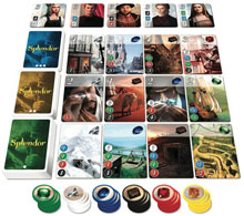 As you can see, cards are laid out in a grid, with stacks to the left and the resources - gems - laid out below. The game plays slightly differently depending on the number of players. The easiest cards to obtain are on the lowest row and the trickier ones on each subsequent row up. You need to obtain 15 victory points by spending gems to buy cards. And that's about it.
The clever bit is that there's all sorts of things going on at the same time and a lot of it is inside your own head...
So, in brief - Each turn you take resources, either one of each of three colours, or two of the same colour (though there is a rule preventing you from continually taking two from the same stack), or you can 'reserve' a card ( up yo three) by taking a gold coin, putting the card in your hand and paying for it later. You can use the golds as an any colour in the game. The final thing you could do is to pay for a card. But you can only do one type of action (collect/reserve/pay) in your turn. If gems run out - too bad, wait for them to come back in again. If someone takes the card you want, too bad, change your strategy. One other thing to note, each card you obtain gives you additional resources to spend, so as you go through the game you should be able to afford more pricey cards! That's the theory until someone takes what you need! Or in my case you keep completely changing your mind...
This was easy peasy to learn and to get to grips with and I can see it absolutely as a 'go to' game where there are 20-30 minutes to spare, or to start a gaming evening off. It's well paced as there is only one action in your turn. It's also ite an 'open' game - it's great being able to see what the others are doing with their resources as you end up thinking about what they might be trying to do as well as trying to look after your own stuff! Set up time is minimal and replayabilty is guaranteed in my view. I can see me getting my gaming-reticent family to play this one, no problems.
Great little runner!
 Posted in: board games