

 22:20
22:20
 Monkeyreado


What I'd thought I would do with this post is to consider a face-off between these two titles. It's Games Workshop vs. Privateer Press.
Games Workshop have recently revamped the design and content of their decades running monthly magazine - we are currently on November's issue (£5.50), the second of the new format. No Quarter is on Issue No. 44 and is bi-monthly ( about £4.50 depending) - representing seven years or so. I love magazines, I confess. And books. I'm not one for Kindles or tablets. I want to turn the pages by hand. A physical sensation. A4 size.If I want a close up, I move the page closer.
Ah, I remember, back in the day, reading RPG backgrounds and 'Thrud The Barbarian' cartoons, all in amongst the various wargaming articles and reviews in the old White Dwarf. I then left for a long time and a few years ago, came back to a completely different publication that was very much focused solely on the models and the Warhammer gaming universes. There wasn't much else. Not that that was a bad thing, I needed lots of information to get going again with all of the gaming knowledge that had bypassed me. And I loved the rich variety of source material that provided ample inspiration for my painting, especially - and here I bow - the fantastic 'Eavy Metal articles that helped me move my painting on to a new level (or at least to a more acceptable one!).
 Why all this preamble? Well, I guess because No Quarter has a bit of that feel about it. There is ample background 'fluff'. Indeed it seems clear that No Quarter is continually helping to build the Warma/Hordes universes as it goes along. The pages often feel like extracts from a 'codex' of sorts. The layout supports this design style too. Pages seem like they have been torn from journals, or from ancient reports and there are a variety of colours and font styles used, which go hand-in-hand with the type of faction being discussed. There is also a great deal of fantastic artwork and and page-edge design that really gives the magazine a sense of coherency across the various different sections of the magazine itself. There are RPG backgrounds, short stories, reviews and articles about other products from Privateer Press. The readers are also represented with examples of their painting and often the opening editorial-style articles show that the staff actually do go out into the wide world.
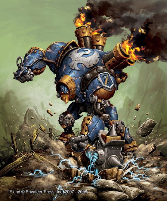 In Issue 44 of No Quarter, you've got detailed conversion articles, the obligatory catalogue pages (only a few though), tournament and painting sections, background, army building, a section on playing scenarios in another game (Level 7), RPG info, battle reports, and readers' models. I do feel that the photographing isn't up to scratch - this sometimes helps blur the fact that some of the models used in the articles aren't quite up to the painting level of WD. There's a lot here, though I would say that compared to White Dwarf, there's a little more of a sense of randomness about the content. I never know quite what I'm going to get! Until recently, with White Dwarf, I knew exactly. It had come to feel too much like a catalogue for the products and if you weren't into this month's catalogue items, you were left a bit miffed at not having a great deal to delve into. I feel that if WD could learn anything, it would be about page design and the use of stories and background to help the universe 'live' in the pages.
Then we come to the new White Dwarf. To begin : I like it. I like it a lot. The strident design, the attempts to show us the real people at GW. I think ' This month in...' is a great idea. The fantastic photographs - and the infinite painting guidance that this represents. I also am really pleased that they have broadened their outlook -Forge World, novels, audio books - golly Fantasy Flight Games even got a look in with their 40K related board game! It feels all the better for this. The articles are also more discursive, exploratory and there is less reliance on a 'wodge' of bat reps. The catalogue feel is still there, however, but it now feels more like a model showcase, with excellent close-ups and atmospheric backgrounds. I'm still not sure what Blanchitsu is for (though I love his painting style and artwork - so keep it coming) and I'm also not really convinced by either of the rather similar, Jeremy Vetock and Jervis Johnson articles. They can all too easily appear to be bland and entirely irrelevant. I also get 'miffed' again at the insistence with the focus of one army per issue (last month 40k Chaos, this month Fantasy Chaos). I mean it says Lord of the Rings of the front, but there isn't any in it!
Furthermore, there are great modelling articles so far, great ideas for terrain, conversions and armies. Let it not seem that I am a ranting sycophant though -oh no. Two concerns -
 1) Fonts and colours of pages. I like the worn appearance of the pages - but really the same font for all armies, all sections - and exactly the same colours? Surely there is some way to differentiate between sections in the magazine that lends clarity to the divisions between the sections. Just flicking thorough, you can't really tell what is where. The font at he moment is a kind of modern-machine-block, like the type on the front. But is this really any good for Elves, Orcs, LOTR etc. It'll seem a bit odd to me. Pedantry perhaps?
2) This is may main gripe so far though - the painting articles are too basic, too short and poorly developed. I think that if, as it seems, the style is to bring in a wider audience, but a more savvy one, then the painting guides have to do so too. Where is my 'Eavy Metal please GW? You've just brought out all of these new paints. Show me how to use them dammit! I am currently watching WarbossTae on You Tube for this...
So, in conclusion. Thumbs up to both. I have perused the various Internet versions of gaming magazines - some have really good sections, but these two lead the way. And - theyr'e real. You can have them by you when you are painting and cart them about in your back pocket, without worrying if you sit on them. I hope to see GW 'tinker' in months to come, I'd like to see PP's magazine grow and add some photograhic finesse. I'll give both 5/5 stars if they sort out my gripes, but for now 3.75/5 for NQ and 4/5 for WD.
 Posted in:


0 comments:
Post a Comment