Sunday, 27 January 2013

Slaine: Books of Invasions Vols 1-3. A quick review of a blast from the past.

2000AD was a staple of my teenage years. I know I'm not alone when I say that. For me it went right alongside the wargaming, the novels and the hobbying. I also know I'm not alone when I say that. After a while my comic reading and collecting grew to a wider experience. DC's The Question, The Dark Knight Returns...and further ...  Stray Toasters (remember that anyone?), 'Nam ,Elektra,and so on - until we get to the trade paperbacks you can read about elsewhere on this blog.

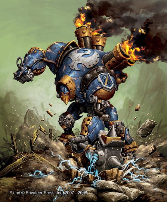
But somewhere along the way 2000AD got left behind. I still have hundreds of the beggars in a box in a cupboard. And that's a real shame because one of my favourite characters is Slaine the King / warrior / berserker and his suffering (insufferable) companion Ukko the dwarf. I loved the work of McMahon, Fabry, Bisley et al. I relished the blood thirsty extravagance of it all. The humour, the darkness, the cultural richness.


That's why I'm at this point. I'm trying to catch up with Slaine and his progress over 'the missing years'. Here are a few thoughts then, about Slaine :Books of Invasions by Pat Mills and Clint Langley. 

The Formorian sea daemons have invaded the Land of the Young and Slaine (as so often, against the advice of his council) and Niamh, his wife, fight back against the evil of Moloch and later, Lord Odacon. Things don't go well, lives are destroyed and desperate measures taken. Even the Earth Goddess Danu's protection appears to require peculiar sacrifices to be made. Leaping through the mud and blood, as always, but without Ukko, Slaine slices left and dices right,  proclaiming 'Kiss my axe!' as he wades in a sea of slaughter.

Not much had changed then. 

This was, throughout, a hugely enjoyable read. I can't quite say if my feelings about these stories were coloured by a sense of nostalgia, all I can say is that it felt good to be back. in the land of Tir Nan Og. The stories - given their episodic format - were neatly told, narratively well paced and balanced between destruction and the journey Slaine has to take. This was how I remembered him.

 It's not an easy journey of course. Along the way he forms alliances with the Scota (an Atlantean tribe), he has to survive challenges form Danu and defeat daemons of might and power, axe and spear in hand. And there is sorrow.

In the last volume the story is completed with a full scale battle, a city under seige and, as an epilogue,  there is the addition of  a return to Ukko, where Slaine finds his son and embarks on a Sherlock Holmes-like investigation into strange goings on among the even stranger denizens of The Carnival.

The final (or most important) and most stunning feature of these volumes is the artwork. It is spectacular in so many ways. Langley uses a mixture of fully painted artwork and digitally manipulated images to create something truly  ... visceral. It has power, sensuality, horror and, in places, beauty. The fire burns. The blood splatters and gushes. The darkness engulfs. This is the point. It's a perfect match for this world of Pat Mills' imagination, which itself 'borrows' from ancient Celtic myths and legends - deliberately so.

Sit down. kick back. Grab a beer. Give yourself time to read these - your eyes will want linger over the details, the colours, the landscapes, the characters (don't read it in dim light, you'll miss bits!) - you won't be stop yourself from exploring the 'widescreen' style pages, inch by astonishing, luxurious, inch.

Sunday, 30 December 2012

Just in ! Dystopian Legions. Kingdom of Britannia. 'Ready. Aim. Fire!'

As one of the 'Christmas arrivals' I have now acquired a Kingdom Of Britannia Starter Set from Spartan Games. It's from their new game based in the same the world as Dystopian Wars. At the moment I guess we're looking at skirmish level gaming here - but I'm assuming that in  time more products will appear to enable the game to be scaled up. These are already coming out. So, there are four Armies - Kingdom Of Britannia, Empire Of The Blazing Sun, Prussian Empire and the Federated States Of America. I believe some mercenaries will eventually find their way out too.

Up and at 'em!

I got a lot of my initial information from the chap at Tales Of A Tabletop Skirmisher - ( http://pressganger.blogspot.co.uk/ ) and he does a pretty good job of reviewing everything that's going on  with this game currently.

I think what caught my eye mainly was the Victorian/steampunk theme of the British set, but it's also clear from the poses and some of the language on the game cards that there is obviously a 'tongue-in-cheek' quality about the whole affair. There are game effects called 'Stiff Upper Lip', 'Tally Ho!' and 'How's that!' for example. And the captain in the Starter Set is called Gilbert Smethington and he clearly has more than a passing resemblance to Flashheart from the Black Adder TV series.

Woof!

Anyhoo I did a vid -


Looking forward to painting and absorbing the quickplay rules which were included in the set. Good value at £37 or so, there's a lot in the box. A free PDF of the quickplay rules is available at Spartan Games as well as some other helpful downloads. 'Carry On, Sergeant!'

Wednesday, 31 October 2012

The new look 'White Dwarf' vs 'No Quarter' ... a penny for my thoughts?


 White Dwarf #395 November 2012

What I'd thought I would do with this post is to consider a face-off between these two titles. It's Games Workshop vs. Privateer Press.

Games Workshop have recently revamped the design and content of their decades running monthly magazine - we are currently on November's issue (£5.50), the second of the new format. No Quarter is on Issue No. 44 and is bi-monthly ( about £4.50 depending) - representing seven years or so. I love magazines, I confess. And books. I'm not one for Kindles or tablets. I want to turn the pages by hand. A physical sensation. A4 size.If I want a close up, I move the page closer.

Ah, I remember, back in the day, reading RPG backgrounds and 'Thrud The Barbarian' cartoons,  all in amongst the various wargaming articles and reviews in the old White Dwarf. I then left for a long time and a few years ago, came back to a completely different publication that was very much focused solely on the models and the Warhammer gaming universes. There wasn't much else. Not that that was a bad thing, I needed lots of information to get going again with all of the gaming knowledge that had bypassed me. And I loved the rich variety of source material that provided ample inspiration for my painting, especially - and here I bow - the fantastic 'Eavy Metal articles that helped me move my painting on to a new level (or at least to a more acceptable one!).

Why all this preamble? Well, I guess because No Quarter has a bit of that feel about it. There is ample background 'fluff'. Indeed it seems clear that No Quarter is continually helping to build the Warma/Hordes universes as it goes along. The pages often feel like extracts from a 'codex' of sorts. The layout supports this design style too. Pages seem like they have been torn from journals, or from ancient reports and there are a variety of colours and font styles used, which go hand-in-hand with the type of faction being discussed. There is also a great deal of fantastic artwork and and page-edge design that really gives the magazine a sense of coherency across the various different sections of the magazine itself. There are RPG backgrounds, short stories, reviews and articles about other products from Privateer Press. The readers are also represented with examples of their painting and often the opening editorial-style articles show that the staff actually do go out into the wide world.


In Issue 44 of No Quarter, you've got detailed conversion articles, the obligatory catalogue pages (only a few though), tournament and painting sections, background, army building, a section on playing scenarios in another game (Level 7), RPG info, battle reports, and readers' models.  I do feel that the photographing isn't up to scratch - this sometimes helps blur the fact that some of the models used in the articles aren't quite up to the painting level of WD. There's a lot here, though I would say that compared to White Dwarf, there's a little more of a sense of randomness about the content. I never know quite what I'm going to get! Until recently, with White Dwarf, I knew exactly. It had come to feel too much like a catalogue for the products and if you weren't into this month's catalogue items, you were left a bit miffed at not having a great deal to delve into. I feel that if WD could learn anything, it would be about page design and the use of stories and background to help the universe 'live' in the pages.


Then we come to the new White Dwarf. To begin : I like it. I like it a lot. The strident design, the attempts to show us the real people at GW. I think ' This month in...' is a great idea. The fantastic photographs - and the infinite painting guidance that this represents. I also am really pleased that they have broadened their outlook -Forge World, novels, audio books - golly Fantasy Flight Games even got a look in with their 40K related board game! It feels all the better for this. The articles are also more discursive, exploratory and there is less reliance on a 'wodge' of bat reps. The catalogue feel is still there, however, but it now feels more like a model showcase, with excellent close-ups and atmospheric backgrounds. I'm still not sure what Blanchitsu is for (though I love his painting style and artwork - so keep it coming) and I'm also not really convinced by either of the rather similar,  Jeremy Vetock and Jervis Johnson articles. They can all too easily appear to be bland and entirely irrelevant. I also get 'miffed' again at the insistence with the focus of one army per issue (last month 40k Chaos, this month Fantasy Chaos). I mean it says Lord of the Rings of the front, but there isn't any in it!

Furthermore, there are great modelling articles so far, great ideas for terrain, conversions and armies. Let it not seem that I am a ranting sycophant though -oh no. Two concerns -

1) Fonts and colours of pages. I like the worn appearance of the pages - but really the same font for all armies, all sections - and exactly the same colours? Surely there is some way to differentiate between sections in the magazine that lends clarity to the divisions between the sections. Just flicking thorough, you can't really tell what is where. The font at he moment is a kind of modern-machine-block, like the type on the front. But is this really any good for Elves, Orcs, LOTR etc. It'll seem a bit odd to me. Pedantry perhaps?

2) This is may main gripe so far though - the painting articles are too basic, too short and poorly developed. I think that if, as it seems, the style is to bring in a wider audience, but a more savvy one, then the painting guides have to do so too. Where is my 'Eavy Metal please GW? You've just brought out all of these new paints. Show me how to use them dammit! I am currently watching WarbossTae on You Tube for this...

So, in conclusion. Thumbs up to both. I have perused the various Internet versions of gaming magazines - some have really good sections, but these two lead the way. And - theyr'e real. You can have them by you when you are painting and cart them about in your back pocket, without worrying if you sit on them. I hope to see GW 'tinker'  in months to come, I'd like to see PP's magazine grow and add some photograhic finesse. I'll give both  5/5 stars if they sort out my gripes, but for now 3.75/5 for NQ and 4/5 for WD.

Saturday, 29 September 2012

Beer and Board Games. Funny as you like...

Found this while surfin'. Enjoyed it heartily. Lots of comedy gold to unearth here. Try it at...

http://www.youtube.com/playlist?list=PLF3E6675A8F9B40EA

Wondering if I can set up my own branch...


Dublooms?
Hirarious.

Friday, 28 September 2012

D and D ... as it should be. Aquisitions Incorporated.

PAX PRIME 2012: Main Theatre


http://www.twitch.tv/pax/b/330756388

So here is this year's offering, and the next installment of, Aquisitions Incorporated. A hilarious playing of D and D - just for fun. IMHO there's a really genuine enjoyment that's at work here and this is why I think it all works so well. It may not have quite the laugh out loud qualities of previous chapters, but nevertheless, hugely entertaining. Well done chaps!
You can follow the previous episodes on YouTube and the original podcast is on the Wizards of The Coast website I think. Have at it!


Thursday, 30 August 2012

Warmachine - Painting Cygnar Coleman Stryker - Last part!

I'm not going to post another update on Stryker after this one. He's just about done and there's only some 'tidying up' to do, as I'll explain later.

Step 9. Beginning to add the cloak colour = P3 Menoth White Base mixed withe P3 Gun Corps Brown at first. Cloak trim and shoulder 'pad' was P3 Exile Blue (as s base) to P3 Cygnar Blue Base then to  P3 Cygnar Blue Highlight with P3 Arcane Blue mixed in for soft highlights.


 Step 10 - added arm with colours as before. The 'glow' was done in the same way as the blue trim but adding GW Azurmen Blue wash before final P3 Arcane Blue and GW Skull White to highlight. There was also a watered down blue wash over the sword and heavier wash around the 'glow'.


The blue on the holster is as on the blue trim.


 Step eleven. I continued to add to highlights on cloak by adding a little GW Skull White to The P3 Menoth White Base. I ensured a thin layer of P3 Gun Corps Brown and P3 Menoth White Mix was washed into recesses of cloak and around trim to allow for shading/definition. however this is something I think I need to return to to make the transition a a little more smooth. It looks too much like a defined band and I'd like the shading to be more gradual.


Drybrush base with P3 Battfield Brown to P3 Gun Corps Brown to P3 Menoth White Base. Add grass to taste.

Ta da!

Friday, 24 August 2012

Painting Cygnar Commander Coleman Stryker.

So here goes - a series of posts describing how I got to where I got to! It's a painting by numbers guide to see what occurred. Feel free to leave me any advice and tips!

This particular Stryker is from the plastic Cygnar Battlegroup and I used a combination of Formula P3 paints and GW/Citadel. It was quite easy to put together but you need to clean all mold lines before you do as some are quite inaccessible after assembly. I left the sword arm off to paint and add later to allow a bit more 'space'.

Step one was the spray black undercoat.

Step two - I used P3 Battlefield Brown for the base colour for the gloves, trousers and gold armour.

Step three - GW Chainmail on silver metal tubing, pipes, buckles and chain armour. P3 Gun Corps Brown on the cloak, 'loin' cloth and wooden handle of pistol. The lighter brown leather colours on gloves, boots and straps was P3 Bootstrap Leather. The blue trim on shoulder and cloak is P3 Exile Blue followed by the P3 Cygnar Blue Base. The face is GW Bugman's Glow. The gold is GW Gehenna's Gold which I found to be quite reddish/orange compared to the old GW Shining Gold.


Front


Back
 With me so far? Take a breath...

Step five - HAIR! I wanted to follow the art from the Warmachine rulebooks so I went for a quite cartoon-like hair colour. Thinking about it I thought might tone it down, it looks like his head's on fire - but then again why not have it a bit extreme? Thus I left it. GW Mournfang Brown undercoat, then Blazing Orange, which I mixed with GW Golden Yellow to get the highlights. Before I added the highlights I put on a GW Reikland Flesh wash.

Head on fire.


Orange Armour...
 Step six - I added some P3 Cygnar Blue Highlight to Blue Base to begin highlighting the blue trip. I will wash with  GW Azureman Blue and then highlight again. There is GW Gryphone Sepia on the Gold armour and GW Nuln Oil on the silver metal. The goggles have  GW Codex Grey rims and will have dark to light blue highlights eventually. Finally, I used P3 Rucksack Tan on the trousers and used GW Agrax Earthshade wash on the leather straps etc. Still not sure what to do with the gun wrist yet.

Step seven - I didn't like the way the gold was coming out - it was too orange. So I mixed GW Burnished Gold and GW Chainmail and drybrushed heavily. I then used GW Agrax Earthsade wash with some water to get a duller more subdued gold.


Step eight - I added P3 Arcane Blue to the previous blues to get a little highlight on the trim etc. but no wash yet. I added GW Mournfang Brown to some of the pouches and other strapping for variety and used the brown GW Agrax Earthshade on these. I also retouched some of the trousers to get a more even paintjob. There you go. Next up the cloak and highlights to the armour and washes to the trousers and the wrist and... Laters...

Twitter Delicious Facebook Digg Stumbleupon Favorites More

 
Design by Free WordPress Themes | Bloggerized by Lasantha - Premium Blogger Themes | Sweet Tomatoes Printable Coupons